Table time…part 2

Friday, May 8, 2015

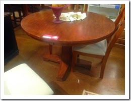
Let’s get back to the table shall we? Last time we talked, this is where we were at:6028601_IMG_1176.jpg

Okay, but there were a few dings and scratches that needed to be taken care of. So, my dad rolled the top into his shop and got to work. I wish that I had taken pictures of the shop while he was working, but I seem not have done that. (hmmm…)

Anyways…

It took a bit of elbow grease and being talked out of painting the table either a shiny black or gray to match the chairs…still on the fence about that one to be honest, but in the end, the result was wonderful

IMG_0736The table is not as shiny as it was before which works for me. It was nice but I like this more subdued looked better.

IMG_0737I left the chairs that came with the table the same color as the table and they do work with other chairs. I covered them in the same fabric as the gray chairs, tying them into the scheme nicely. (did I mention that before? I can’t remember)

Not the same but a nice coordination of what I already have.

I took one of the extra chairs from the table and covered in something different to go in the bedroom. IMG_0730(is it just me or do I need to start taking better and more pictures?)

It’s a nice piece to sit and put on your shoes or just lay out clothes for the next day. Perhaps at a later date I’ll get one of those lush club chairs to serve this purpose but for now…I’m liking this addition as well.

And so ends the saga of my table love. I do like the roundess of the table for an apartment dining room. It does not take up a lot of space and is easy enough to accomadate more people if needed. Now, if I could just get more light into the space…I’d be happy.


Bedroom styling

Friday, May 1, 2015

I’m not sure if I mentioned it earlier or not, but I have been on the hunt for a headboard. I wanted one of those lush, heavily tufted, wingback armed headboards. Something that made a statement and just made the eyes happy to see. I searched high and low and found quite a few pieces that I fell in love with…until I saw the prices.

Not so much in love.

So…I decided to embark on the adventure of making one for myself. I’ve watched all the YouTube videos, seen all the blogs of crafty DIYer’s. I was confident that I could do it.

Why does not one tell you that the longest hardest part if just finding the right fabric!?

Anyways…

After searching high and low,  I found fabric that I could be happy with and proceeded to produce my masterpiece. My mother and I worked diligently on this project for about two days. We tried to rope my dad in, but he was not having it. Oh well

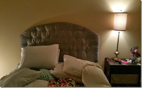
After the addition of some nice sparkly buttons, I think that I did a good job.

IMG_20150318_210310

pay no attention to the mound of pillows on the bed or the untidiness. I took the picture right after hanging it on the wall and I seem to have lost all my other cook photos of this creation.

If I’m honest, this is not the result I was looking for. I do enjoy, but I think that I may have to bite the bullet and buy what I really want. Either that, or not let my mother help me with it next time. I wanted it more lush than this and my mother was like “Why?”

That should have been a hint, but alas…it was not.

Full exposure thoughts

Friday, March 6, 2015

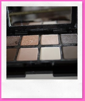
I recently made a new palette purchase, having finally given into the hype. I’d been eyeing the the smashbox double exposure palette since it came out, but could not justify the price without testing out some of their other eye shadows. I decided to take the plunge and I picked up this one:
IMG_0793
I know, not quite the same, but figured that the quality should be on par since it’s the same company and all. I brought it home and just oohed and awed over it for a bit, thinking of all the looks I could do with it.
 IMG_0792 (a shot of the all the colors.)
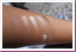
I probably should have done some swatches while I was at Ulta before brining it home, but this one was up at the registers, so not really the place to be testing things out. As you can see below, I’m the color pigmentation is okay, but not at all what I was expecting from glancing at the full palette’s. IMG_0798(samples swatches)
IMG_0799(A better look)
One the arms, the colors show up alright, but on the lid, I have to be honest that the colors did not show up the way I was hoping for. I know one has to build and blend, but I felt that if I had actually dug into the shadows, I would have received better color pay off. The good part is that there was no fallout or heavy chunks like I found in the lorac gold palette (another story).
The neutrals in this palette are nice and could probably be used as transition colors. Some of the other colors though are a bit light, almost ashy on my skin tone and they will not be used for much.
In the end, I’m not sure how much usage I’ll get out of it, but I do plan to keep it and try to work it into a few looks. It is good for travel and maybe with a nice base, these colors will pop better.
DESIGNED BY ECLAIR DESIGNS